The first weekend of June was a busy one for us, and we kicked it off by going to the opening night of Artomatic. This was the first time I’d been to an Artomatic in a new building, and it was a bit odd. The two I’d previously attended had been in buildings that were about to be torn down, which made the whole experience kind of spooky and reminiscent of unauthorized versions of these events that people I knew used to have in abandoned factories and warehouses in Philly in the mid-90’s. This time around, we took the elevator to the ninth floor and had panoramic views of the mall.
Our first stop was to see our friend Todd’s work—conveniently located on the ninth floor, meshing well with our plan to ride up and walk down. After spending some time stalking him in order to congratulate him on his pieces, we wandered over to the robot drawing area, easily identifiable by the many young children crowded around the tables. As promised, the robots we drew on postcards and submitted to the RobotDisorder folks are now part of an Artomatic poster! (Mine is sixth from the left in the top row and my partner’s is fifth from the left in the second row down.)
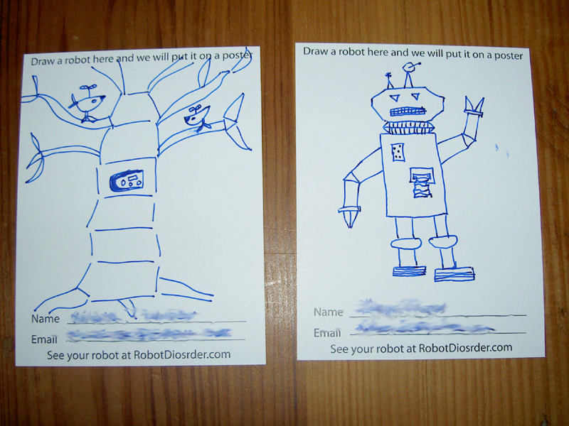
Our robots.
While little can compare to getting to draw your own robot, there were several other displays that I particularly liked. I was sorely tempted to purchase an insect with spatula wings, but I couldn’t think of a suitable place to display it. Now that the living room is painted, I’m tempted to go back for one for the unoccupied end of the mantle. Another favorite was the work of Novie Trump, an artist who lives nearby and whose work I’d seen at an Artomatic preview show that Todd took us to inauguration weekend. Her forms are lovely, and she has an excellent ability to mix texture and color in her use of clay; I find her small works melancholy and yet alive. Although I wasn’t moved by all of his pieces, Rick Braswell had a beautiful photograph of an Italian piazza that I could have stood and looked at all night.
The beauty of Artomatic is that there’s truly something for everyone: my partner spent much time with the action figure dioramas of one group of Frederick artists and the comic strips of another, ending the evening by getting his photo taken with the lifesize peep. I wandered down to the PostSecret area, joining the crowd in looking through a pile of actual postcards, but wasn’t brave enough to be recorded as part of the video project even if I could have come up with a secret on the spot.
Since we’re old now, we only got through three floors before it was way past our bedtime. Our plan is to return next before the end of the show, but the weekends are filling up quickly. The beauty of Artomatic is that there’s always more art to be seen.
